Tuesday, October 31, 2006
Painting the Sun King
Moved!
YES!! I'm done moving. You can't even imagine how relieved I am to be done with that! Thank you for all your encouragements, guys.
Two weeks ago, I made another picture for the art challenge we have going on at Avalanche Software. The topic was royalty. I've decided to use Louis XIV, the Sun King.
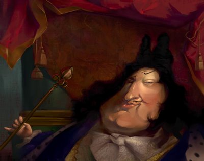
I always like when people show a little bit of their creation process. It helps me understand new techniques and other ways of thinking. I wanted to do the same, just to look "pro" like them! :) (pour me la pété quoi! :) )
So here are a few steps of the Sun King.
Enjoy!
1 - I always start with a crappy drawing. Lately, I've been so excited to move on to color that I don't take the time to make a good drawing... Shame on me!! I scan it quickly and go to Painter.
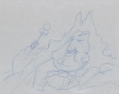
2 - I usually select a pretty neutral color to start with. In this case, I was going for the pretty dark color theme of Louis's time. I use the famous "washa brusha" of Ryan Wood that gives me random variations of my original color. I don't exactly know what it is. It’s just magical! :)
Sam Nielson told me something a few months ago that really helped me move on from my "paint by number" technique (see my graphic novel from the last post) to ... well... a better technique! :) He said: "I'm trying to be a messy painter". That really struck me. It's what I’ve been trying to do since then: be a messy painter. (Thanks Sam!)
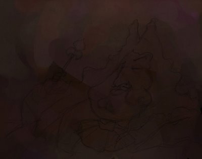
3 - I mostly use the 2B pencil (with the "Method" changed from "Build up" to "Cover"), an acrylic brush and the washa brusha. Using 3 different brushes helps me to have more texture variety.
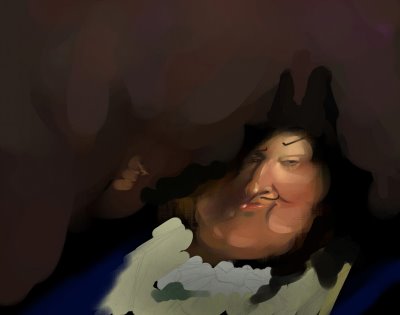
4 - I start working more on the background. I should have built up the whole picture at the same time to keep a constancy of color and shape but I couldn’t help it: the face was pushed pretty far along before I even started worrying about the background. It’s a bad habit to work on one little area at a time. I’m trying to change it.
Louis’s neckerchief was almost as bright as the face. I toned it down to keep the focus on the face.
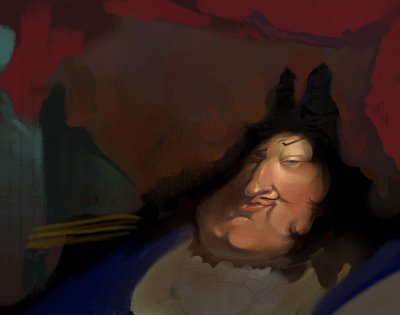
5 - When I’m done blocking the colors, the rest is easy: details! I put a few textures in Overlay to simplify my work.
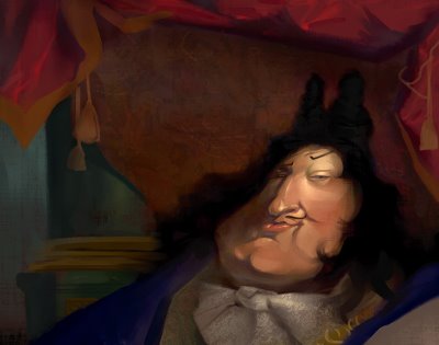
6 – Toward the end, I’ve decided to put the hand and the scepter back in the picture. I made them small to emphasize his fatness! :)
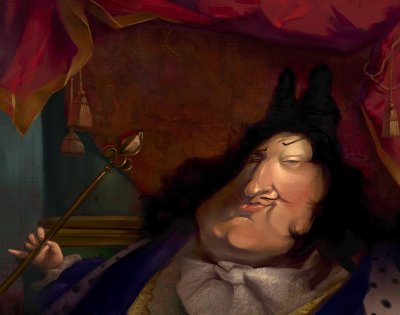
The end!
I hope my broken English made any sense to you guys. :)
YES!! I'm done moving. You can't even imagine how relieved I am to be done with that! Thank you for all your encouragements, guys.
Two weeks ago, I made another picture for the art challenge we have going on at Avalanche Software. The topic was royalty. I've decided to use Louis XIV, the Sun King.

I always like when people show a little bit of their creation process. It helps me understand new techniques and other ways of thinking. I wanted to do the same, just to look "pro" like them! :) (pour me la pété quoi! :) )
So here are a few steps of the Sun King.
Enjoy!
1 - I always start with a crappy drawing. Lately, I've been so excited to move on to color that I don't take the time to make a good drawing... Shame on me!! I scan it quickly and go to Painter.

2 - I usually select a pretty neutral color to start with. In this case, I was going for the pretty dark color theme of Louis's time. I use the famous "washa brusha" of Ryan Wood that gives me random variations of my original color. I don't exactly know what it is. It’s just magical! :)
Sam Nielson told me something a few months ago that really helped me move on from my "paint by number" technique (see my graphic novel from the last post) to ... well... a better technique! :) He said: "I'm trying to be a messy painter". That really struck me. It's what I’ve been trying to do since then: be a messy painter. (Thanks Sam!)

3 - I mostly use the 2B pencil (with the "Method" changed from "Build up" to "Cover"), an acrylic brush and the washa brusha. Using 3 different brushes helps me to have more texture variety.

4 - I start working more on the background. I should have built up the whole picture at the same time to keep a constancy of color and shape but I couldn’t help it: the face was pushed pretty far along before I even started worrying about the background. It’s a bad habit to work on one little area at a time. I’m trying to change it.
Louis’s neckerchief was almost as bright as the face. I toned it down to keep the focus on the face.

5 - When I’m done blocking the colors, the rest is easy: details! I put a few textures in Overlay to simplify my work.

6 – Toward the end, I’ve decided to put the hand and the scepter back in the picture. I made them small to emphasize his fatness! :)

The end!
I hope my broken English made any sense to you guys. :)
Thursday, October 26, 2006
Hey guys!
Sorry, I didn't post for so long! I've been extremely busy lately. I'm in the middle of moving (packing, change of address etc...) I'm recording a 6 songs EP with my band and on top of that we have a lot of concerts and practices etc... etc...
Life is CRAZY!
I apologize for not answering your comments.
Anders and S.D. : Yes, I've been really influence by Regis Loisel in my early years. He is not my favorite anymore though. This graphic novel is 5 to 6 years old. I'm not quite sure which style I would have if I was to start a new project now.
Anders, here are a few more pages of this project. Be merciful! :) It's OLD!!
I also posted one page back in August if you are interested.
See you guys later.
Take care
Seb
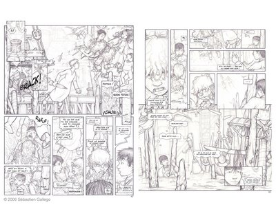
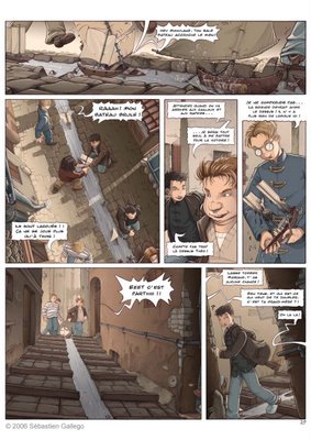
I run out of space at the end of the album to tell all I wanted to tell. It's way too busy and confusing but hey, I was young and unexperienced! :)
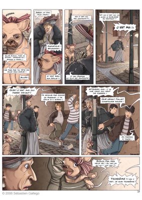
Now that I read it I think: WOW! The dialogues are SO cheesy and weak!
Life is CRAZY!
I apologize for not answering your comments.
Anders and S.D. : Yes, I've been really influence by Regis Loisel in my early years. He is not my favorite anymore though. This graphic novel is 5 to 6 years old. I'm not quite sure which style I would have if I was to start a new project now.
Anders, here are a few more pages of this project. Be merciful! :) It's OLD!!
I also posted one page back in August if you are interested.
See you guys later.
Take care
Seb

I run out of space at the end of the album to tell all I wanted to tell. It's way too busy and confusing but hey, I was young and unexperienced! :)

Now that I read it I think: WOW! The dialogues are SO cheesy and weak!

Monday, October 16, 2006
Back in the day...
Thursday, October 12, 2006
Links
I just updated my links (finally!). Go check these great artists/friends. You won't regret it!
Friday, October 06, 2006
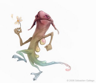
Meet Herb
Herb is a narcitoxic monster.
He's a real health hasard. When he get too close to you, you start feeling nauseated and you finally pass out. He thinks that people are falling around him just because he's so hot looking and that they can't stand his perfect features.
That's why Herb won the price of the most narcissistic creature on the planet last year.
Good job Herb!

Thursday, October 05, 2006
Lost
Hi everybody,
Sorry, I didn't post for a while. I've been sick for nine days in row! A really bad flu. I feel much better right now and I'm ready to post again.
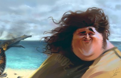
Here is a pic I've done for the Art Challenge we have from time to time at Avalanche Software (the video game company I work for). I invite you to go to the Avalanche blog we started. It's a lot of fun!
Just follow the link for more pics of "Lost"!

Subscribe to:
Comments (Atom)
