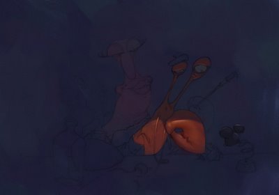
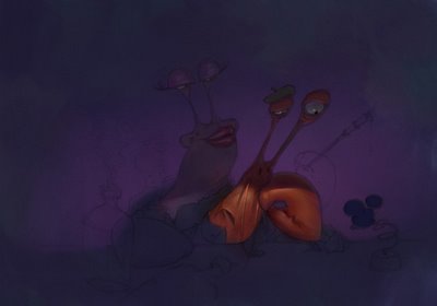
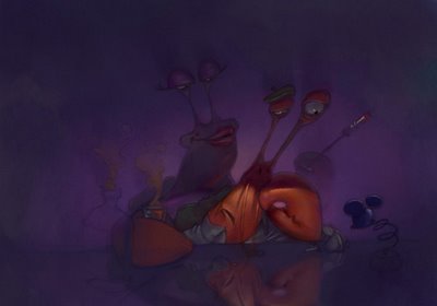
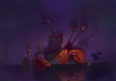
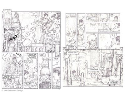
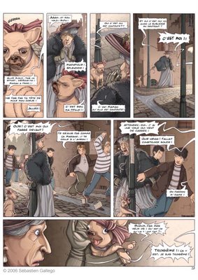
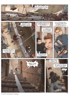
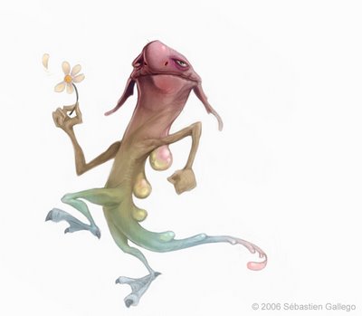
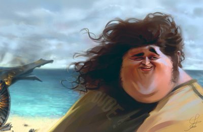
I started working on a new comic book with a really talented friend of mine, Loic Nicoloff. It's going to be pretty short, 4 pages only. Loic is working on the story right now. I invite you to go check out his website (there is a English version too). Lots of cool stuff!
It's a fairly new project so I can't say much but here are the first character explorations.
Thursday, December 28, 2006
Thursday, December 21, 2006
Invitation to the 30 mins painting exercise
It seems like a few people might be interested in starting these 30 minutes paintings with us. Obviously, everybody is invited!
I started this exercise last week for myself and quickly invited Oliver Chipping and Jason Scanlon to join me. I made a few rules that I think keep the essence of the exercise (which is some kind of "Digital Alla Prima"). I invite you to follow them so that we can compare our paintings knowing that they are done following the same restrictions.
You'll see, this exercise is really addictive!!
Here are the rules:
- use a picture as reference or if you are lucky enough to have a laptop, do it from life.
- make it in 30 minutes or less
- never use the dropper tool to pick up the colors directly from the picture
- use only ONE layer
- keep the picture under 1000 pixels by 1000 pixels (I guess this rule is not that important, the idea is to keep it small)
Have fun and remember: 30 mins, not 32!!! :) It's harder to stop than you think!
I'm excited to see what you guys will come up with.
Monday, December 18, 2006
More quick paintings with the flu
Well, I'm sick as a dog today (although I don't know what a sick dog looks like, it must not be pretty...) The only advantage I can see of being sick is that I had time yesterday for more 30 mins paintings, the only thing I could do. Here are the last ones. It's getting there.
Please wash your hands after visiting this page, I'm contagious!
Sunday, December 17, 2006
30 mins paintings of the week
Here are my 3 favorites of the week. I feel like I learned a lot with these. I'm discovering which brushes I'm the most confortable with. It's usually really hard to stop after 30 minutes. There are so many things I would like to fix, so many improvements to make but... hey, that's not the purpose of the exercise!
Please, feel free to give me critiques on these.
See you at the end of next week for more.
Please, feel free to give me critiques on these.
See you at the end of next week for more.
Wednesday, December 13, 2006
30 Minutes Painting Project
I just went trough a rush time which is finally over. So I'm back on my blog... finally!
Lately, I've been thinking of new ways to get better and go to the next level as an artist. I named one of my new idea "The 30 mins Painting Project". This is actually not something new but I made a few rules for myself to keep the essence of the exercise. Basically, I'm going to make a painting everyday using a photo as reference. The rules are:
- to make it in 30 minutes or less
- to never use the dropper tool to pick up the colors directly from the picture
- to use just ONE layer
- to keep the picture under 1000 pixels for height and width (which is a lot for some people, I now! But I'm planning on being so good that I'm going to paint every single leaf eventually! :) )
So here it is. I hope this exercise will help me understand colors better and be looser with my paintings. These are the two mains purposes of this self inflected exercise. I'm going to start with landscape and move on to figures eventually.
Here are my first ones from yesterday and today (30 mins each).
Hope everybody is doing well. I'm sorry again if I don't reply to all the comments. I really appreciate them though.
Have a good day everybody!
Sebastien
Thursday, November 30, 2006
Monday, November 27, 2006
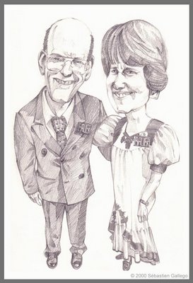
The Bauers and Chicken Little 2
Here is the portrait of two persons I really like. I did it a long time ago but I still like it. Don't worry, I told them it was a caricature and not an actual portrait! :)
Pretty soon Chicken Little 2 the video game will be available and I'll be able to put some of the concept art I did for it on this blog. What I did for Avalanche over the past few months is my best stuff. Unfortunatly, I have to wait for the games's releases to share it with you.
Soon soon, fresh stuff!
Thursday, November 16, 2006
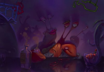
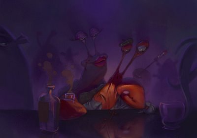
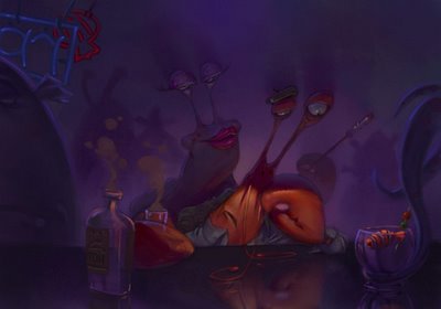
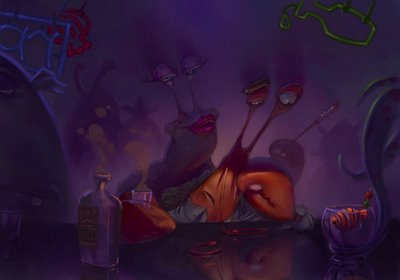
Jacque le Crabe (Jack the Crab)
Here is another illustration I made for the Avalanche Art challenge. The topic this time was: "Creatures of the Deep"
Jacque is a French actor; well, I should say was a French actor. See, Jacque’s career started splendidly: after just a couple of successful plays in New York, he got a part in a Disney movie, playing some kind of a conductor/babysitter. Later on, he played an obsessive compulsive in a Pixar production. He even performed on Broadway!
Unfortunately for Jacque, parts for French crustacean started to get sporadic. He tried to move on to TV but without success. He just got one part as an extra in the TV show “Lost”. You could see him scurry past Hurley’s feet at one point…
Now Jacque is drinking all alone at the Triton Café ready to be the victim of a deep, very deep depression.
It’s hard to be a French crab sometimes!
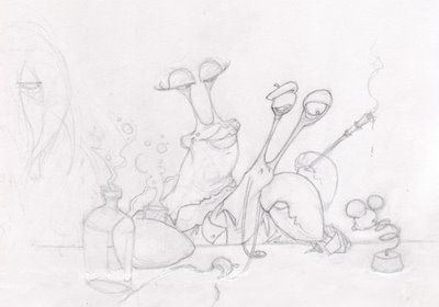
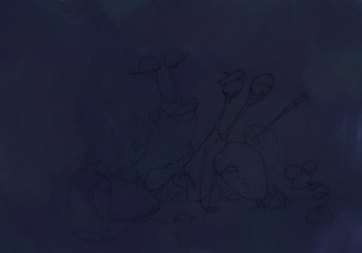
Here is a step by step again.
Enjoy!
Seb
Wednesday, November 15, 2006
Tuesday, November 14, 2006
Friday, November 10, 2006
Sketchbook Time
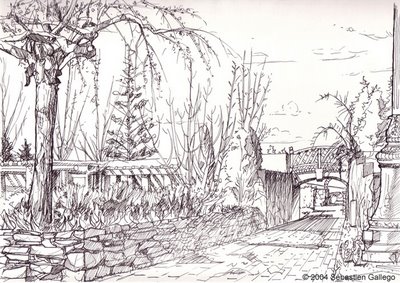
Here is a little bit of my sketchbook. I like to sketch direclty in ink to help me gain more confidence (you just have one chance, that's all!!) and stop dudeling.
I did this one at Thanksgiving point (for those from Utah who know the place)
And this one is from my favorite place to draw: the junkyard! :)
I did this one at Thanksgiving point (for those from Utah who know the place)
And this one is from my favorite place to draw: the junkyard! :)
Wednesday, November 08, 2006
Tuesday, November 07, 2006
Monday, November 06, 2006
My best creation
Thursday, November 02, 2006
Tuesday, October 31, 2006
Painting the Sun King
Moved!
YES!! I'm done moving. You can't even imagine how relieved I am to be done with that! Thank you for all your encouragements, guys.
Two weeks ago, I made another picture for the art challenge we have going on at Avalanche Software. The topic was royalty. I've decided to use Louis XIV, the Sun King.
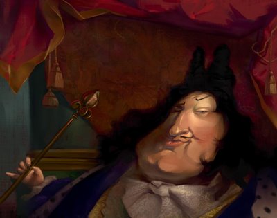
I always like when people show a little bit of their creation process. It helps me understand new techniques and other ways of thinking. I wanted to do the same, just to look "pro" like them! :) (pour me la pété quoi! :) )
So here are a few steps of the Sun King.
Enjoy!
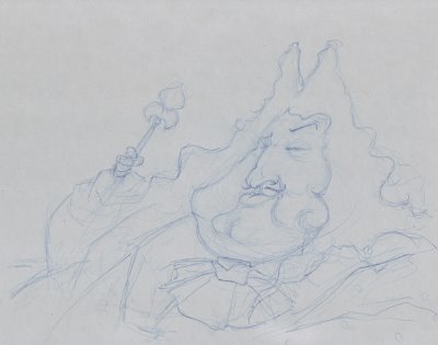
1 - I always start with a crappy drawing. Lately, I've been so excited to move on to color that I don't take the time to make a good drawing... Shame on me!! I scan it quickly and go to Painter.
2 - I usually select a pretty neutral color to start with. In this case, I was going for the pretty dark color theme of Louis's time. I use the famous "washa brusha" of Ryan Wood that gives me random variations of my original color. I don't exactly know what it is. It’s just magical! :)
Sam Nielson told me something a few months ago that really helped me move on from my "paint by number" technique (see my graphic novel from the last post) to ... well... a better technique! :) He said: "I'm trying to be a messy painter". That really struck me. It's what I’ve been trying to do since then: be a messy painter. (Thanks Sam!)
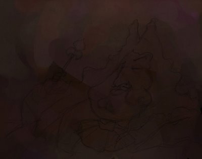
3 - I mostly use the 2B pencil (with the "Method" changed from "Build up" to "Cover"), an acrylic brush and the washa brusha. Using 3 different brushes helps me to have more texture variety.
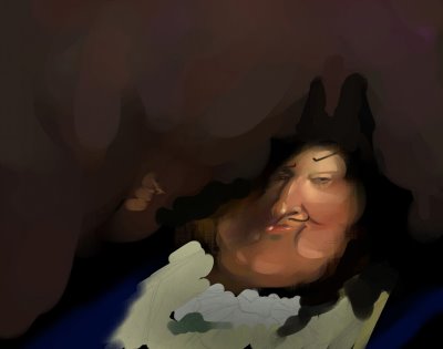
4 - I start working more on the background. I should have built up the whole picture at the same time to keep a constancy of color and shape but I couldn’t help it: the face was pushed pretty far along before I even started worrying about the background. It’s a bad habit to work on one little area at a time. I’m trying to change it.
Louis’s neckerchief was almost as bright as the face. I toned it down to keep the focus on the face.
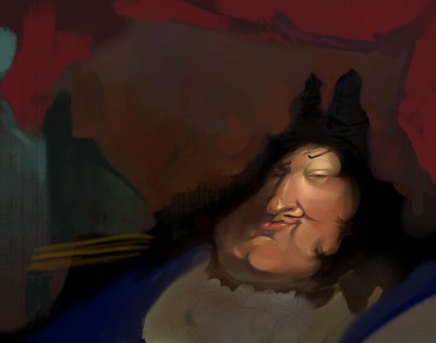
5 - When I’m done blocking the colors, the rest is easy: details! I put a few textures in Overlay to simplify my work.
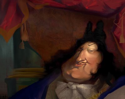
6 – Toward the end, I’ve decided to put the hand and the scepter back in the picture. I made them small to emphasize his fatness! :)
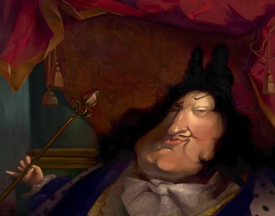
The end!
I hope my broken English made any sense to you guys. :)
Thursday, October 26, 2006
Hey guys!
Sorry, I didn't post for so long! I've been extremely busy lately. I'm in the middle of moving (packing, change of address etc...) I'm recording a 6 songs EP with my band and on top of that we have a lot of concerts and practices etc... etc...
Life is CRAZY!
I apologize for not answering your comments.
Anders and S.D. : Yes, I've been really influence by Regis Loisel in my early years. He is not my favorite anymore though. This graphic novel is 5 to 6 years old. I'm not quite sure which style I would have if I was to start a new project now.
Anders, here are a few more pages of this project. Be merciful! :) It's OLD!!
I also posted one page back in August if you are interested.
See you guys later.
Take care
Seb
I run out of space at the end of the album to tell all I wanted to tell. It's way too busy and confusing but hey, I was young and unexperienced! :)
Now that I read it I think: WOW! The dialogues are SO cheesy and weak!
Monday, October 16, 2006
Back in the day...
Thursday, October 12, 2006
Links
I just updated my links (finally!). Go check these great artists/friends. You won't regret it!
Friday, October 06, 2006
Meet Herb
Herb is a narcitoxic monster.
He's a real health hasard. When he get too close to you, you start feeling nauseated and you finally pass out. He thinks that people are falling around him just because he's so hot looking and that they can't stand his perfect features.
That's why Herb won the price of the most narcissistic creature on the planet last year.
Good job Herb!
Thursday, October 05, 2006
Lost
Hi everybody,
Sorry, I didn't post for a while. I've been sick for nine days in row! A really bad flu. I feel much better right now and I'm ready to post again.
Here is a pic I've done for the Art Challenge we have from time to time at Avalanche Software (the video game company I work for). I invite you to go to the Avalanche blog we started. It's a lot of fun!
Just follow the link for more pics of "Lost"!
Subscribe to:
Posts (Atom)